Uptown HTML
CSS3 Media Inquiries
A media query are added in CSS3 style sheet witch consists of a media type and at least one expression that limit the style sheets' scope by using media features, such as width, height, and color.
Objective
In this lesson you will be learning how to use media queries to make your site responsive due to the width of the screen and to respond to the specific properties of your choice.
Sub Objective
This lesson will include the following key features about media queries such as min-width, max-width, min-device-width, max-device-width, min-height, max-height, min-device-height and max-device-height.
You will also learn about the media types such as all, aural, braille, handheld, print, projection, screen, tty, tv and embossed. Also the medias key words like and, or, not, and only
View Demo
The Media Types
First before we start creating our css media quiries we need to verify the proper media type that we prefer to use, but first we need to understand all of the different media types witch is listed below. You will also see how these media type would be written inside of your ccs in the example code box below.
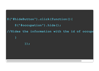
//media type goes where the highlighted word is located below.
@media only screen and (min-width: 768px) and (max-width: 991px) {
.ex_box1{
	background-color: #069;
	}
}
all: Used for all media type devices
aural: Used for speech and sound synthesizers
braille: Used for braille tactile feedback devices
embossed: Used for paged braille printers
handheld: Used for small or handheld devices
print: Used for printers
projection: Used for projected presentations, like slides
screen: Used for computer screens
tty: Used for media using a fixed-pitch character grid, like teletypes and terminals
tv: Used for television-type devices
For this lesson we are going to use the media type (screen).
The Medias Key Words
Now we need to discuss the medias key words, but for this lesson we are going to use the key word (only). As you see below this feature is being used in the sample code and will be implemented later on in the lesson.

//media key word goes where the highlighted word is located below.
@media only screen and (min-width: 768px) and (max-width: 991px) {
.ex_box1{
	background-color: #069;
	}
}
These key words are used to
and: This condition "and" this condition must equal true for browsers to apply the stylesheet.
or: This condition "or" this condition must equal true for browsers to apply the stylesheet.
not: "not" will do everything, but what you type after it. Also, older browsers that do not support media types will not recognize the "not" keyword and therefore the stylesheet is not applied.
only: Older browsers that do not support media types will not recognize the "only" keyword and therefore the stylesheet is not applied.
The Medias Min And Max
The Min and Max is the key components to getting a query to work. This determines when the query styles will take affect. You can determine the Min and Max by creating a number in pixels as shown in the code below.

//media quer Min and Max are the highlighted words located below.
@media only screen and (min-width: 768px) and (max-width: 991px) {
.ex_box1{
	background-color: #069;
	}
}
min-width: greater or equal to width constraints
max-width: smaller or equal to width constraints
min-device-width: greater or equal to device width constraints
max-device-width: smaller or equal to device width constraints
min-height: greater or equal to height constraints
max-height: smaller or equal to height constraints
min-device-height: greater or equal to device height constraints
max-device-height: smaller or equal to device height constraints
Separate Stylesheets
You have seen that media queries can be created in your css but there’s also another way to create these queries. You can also create media queries by just putting them inside of your link tag when you link your css to your html document.

//A typical linking style sheet looks like this
<link rel="stylesheet" type="text/css" href="style.css" />

//if you add one of the media queries then the highlighted part is where you would place your media query
<link rel="stylesheet" media="screen and (max-width: 700px)" type="text/css" href="narrow.css" />
There are a few different ways you would right this depending on your specific purpose. Here are a few listed below:
iPhone 4: <link rel="stylesheet" media="only screen and (-webkit-min-device-pixel-ratio: 2)" type="text/css" href=”iphone4.css" />
For iPad: <link rel="stylesheet" media="only screen and (max-device-width: 1024px)" href="../ipad.css" type="text/css" />
The Lesson Plan
Now that you understand media queries try and create something similar to the finished peace at the bottom of the page. Only use the code that is given and make sure your max-width does NOT go pass 1024px and your min-width dose NOT go under 320px. Try to implement this in your own way, remember you can add any CSS styles that you would like.

@media only screen and (min-width: __px) and (max-width: __px) {
.ex_box1{
	background-color: #___;
	}
}
If you would like to see the code for the finished piece it is listed below in the code box. Also if you are having a little trouble creating your media query, try and use some of the styles and the media format from the code below to assist you on your creation.
/*CSS3 Media Inquiries*/
@media only screen and (min-width: 768px) and (max-width: 991px) {
.ex_box1{
	height: 50px;
	width: 50px;
	background-color: #069;
	color: white;
	float: left;
	text-align: center;
	border-radius: 30px;
	margin-right: 3px;
}
.ex_box2{
	height:50px;
	width:50px;
	background-color:#903;
	color:white;
	float: left;
	text-align: center;
	border-radius: 30px;
	margin-right: 3px;

}
.ex_box3{
	height:50px;
	width:50px;
	background-color:#6C9;
	color:white;
	float: left;
	text-align: center;
	border-radius: 30px;

}
}
@media only screen and (min-width: 320px) and (max-width: 480px) {
.ex_box1{
	height: 50px;
	width: 30px;
	background-color: #069;
	color: white;
	float: left;
	text-align: center;
	border-radius: 30px;
	margin-right: 3px;
}
.ex_box2{
	height:50px;
	width:30px;
	background-color:#903;
	color:white;
	float: left;
	text-align: center;
	border-radius: 30px;
	margin-right: 3px;

}
.ex_box3{
	height:50px;
	width:30px;
	background-color:#6C9;
	color:white;
	float: left;
	text-align: center;
	border-radius: 30px;

}
}
/*CSS3 Media Inquiries*/
Related Sources
If you would like to see more use of the media queries just visit the sites listed below and make sure to pull the screen left and right to see the full actions of the queries.
(Peak Performance Fitness Center)
The Finished Peace
Now that you understand how to successfully use CSS media Inquiries, try and test your self on what you have learned by taking the quiz located on the right side of the screen. GOOD LUCK!!!
Pull the screen width wise to see the affects of the three squares below.
p1
p2
p3
